Grand Canyon of the Yellowstone

March 30, 2012

- See all 9 of my articles

No Comments


Thomas Moran, Grand Canyon of the Yellowstone

 
[Editor’s note: I’d like to take this time to mention that Princess Kate is now on her way to becoming Dr. Kate.  She has been accepted into a PhD program.  Congratulations.  -Kosmo]

No reproduction can do this painting justice. It’s enormous, seven feet high and twelve feet long, expansive yet exquisitely detailed, seemingly lit by the real sun. Thomas Moran’s Grand Canyon of the Yellowstone not only permanently changed American landscape art, it also changed how Americans thought of themselves and their country.

Despite the painting’s misleading title, Moran’s painting depicts the Lower Yellowstone Falls in Wyoming. The Yellowstone River plunges 308 feet over the falls – twice the height of Niagara Falls (although with considerably less water, as the river is only 70 feet wide at this point, compared to Niagara’s half-mile). The largest volume waterfall in the American Rockies, the falls are so impressive that many early visitors greatly overestimated their height. An especially hyperbolic news story from 1867 lists the height at 1000 feet.

Immigrant painter, American landscape

Moran’s painting certainly emphasizes the magnificence of the scene. A native of England, Moran and his family settled in New York where he became an illustrator for Scribner’s Monthly, an illustrated monthly magazine published from 1870 to 1881. Moran first heard of Yellowstone after illustrating Nathaniel Langford’s account of the Washburn-Doane expedition through Yellowstone in 1870. His illustrations were based solely on Langford’s descriptions of these wild places he had never seen. Intrigued by Langford’s reports of soaring mountain peaks, endless rivers, and wide open skies, Moran convinced Jay Cooke, president of the Northern Pacific Railroad to finance his trip west. Cooke secured Moran a place on the Hayden Geological Survey, led by geologist Ferdinand Vandiveer Hayden. The survey left from Virginia and explored the northeastern corner of Wyoming that would later become Yellowstone National Park.

Many people assume that national parks were set up purely for conservation purposes – making sure exquisite pockets of American wilderness remain so in the quickly evolving landscape. This is untrue. By and large, national parks were created to generate income from tourists. The Northern Pacific Railroad had a lot to gain from a major tourist attraction along their western line. Hayden’s entire expedition relied on the generosity of railroad magnates like Cooke, as well as federal funds.

Shifting Perspectives

Along with famed landscape photographer William Jackson, Moran spent the expedition recording the beauty of the American west. Unlike Jackson’s photographs, which had to be painstakingly staged, Moran was free to sketch whenever and wherever he chose. He sketched the falls and canyon over and over from various vantage points and angles, determined to capture every aspect and color. When the survey returned in the fall of 1871, both Moran’s sketchbook and memory were full of nothing but the falls. A selection of these sketches illustrated Hayden’s exclusive article in Scribner’s describing the expedition. Many of these sketches would later be reworked in Grand Canyon of the Yellowstone.

Always careful to explain that his paintings were not “literal transcripts from Nature,” Moran strove to portray the wild spirit of Yellowstone through his enormous painting, without tying himself to topographical and geological exactitude. The seven by twelve foot canvas took two months to paint. The resulting painting was immediately hailed as a masterpiece.

In an era where not many people traveled, illustrations and paintings like Moran’s were Americans only window to the western frontier. Photographs, still grainy and black and white, couldn’t yet capture the sublime nature of Yellowstone, the magnificence and scale of the canyon. Americans, used to looking to the large cities of the eastern seaboard and to Europe for inspiration, now began to look west, and to consider the wide sky of the Rockies and beyond part of their natural birthright. This God-given beauty, so perfectly captured by Moran, was part of being American.

Enhanced by Zemanta

Your Lithograph Makes Me Look Fat: George Bellows and Reducing

February 24, 2012

- See all 9 of my articles

No Comments


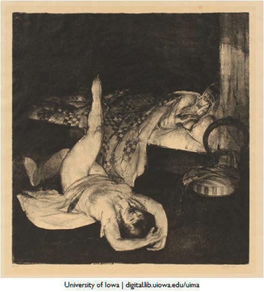
George Bellows, Reducing, 1916, lithograph, 17.5 x 16.5
University of Iowa Museum of Art.


In 1916, artist George Bellows produced this lithograph, the second of three in a series depicting women doing calisthenics while their husbands slumber peacefully unaware. Best know for his depictions of men’s lives in rough and tumble turn of the century America, these lithographs are a distinct departure for the artist, and represent his acknowledgment of the changes in store for women in the early 1900s. The woman depicted is forcing herself through exercises to meet the changing standard of beauty. The transformation in the ideal female figure from voluptuous to slim was as dramatic, and, for many women, challenging, as any other modification of modern 20th century life.

The Eternal Debate

A slender physique was often an available body ideal in Western culture, from the Aristotelian moderation of the Greeks to Christian ascetics whose revulsion of gluttony and the overweight came to America with the Puritans. However, until the last few decades of the nineteenth century, plumpness was largely the preferred physique for women. Full-figured women have a long tradition in Western art (Ruben’s chubby goddesses being perhaps the best known example of this), and the art of the nineteenth century largely maintained this tradition.  Prominent nineteenth century stage actresses endorsed the popular body type by adding prominent bustles to their undergarments, adding boost to prominent derrieres to match the ample bosoms created by corsets. Women, especially those who had given birth, were supposed to be curvy.  While thinness was seen as a sign of impending nervous disorders and general ill health, women with meat on their bones were linked to successful motherhood and genial good health.

An American Tale

This proclivity for plump figures, while fairly universal in the latter decades of the nineteenth century, had some overtones that were specifically American.  America was a land of plenty, and the sheer size of their food and the large portions offered were drew frequent comments from foreigners.  Visitors used to slight European portions at meals were stunned by the size of American game and produce, and the subsequently enormous meals that graced their plates. Women’s magazines like Godey’s Lady’s Book began publishing multiple recipe features in each issue, often concentrating on high-calorie offerings like cake.  A single issue of the magazine could offer instructions on how to create pound cake, cream cake, chocolate cake, strawberry cake, and spice cake.  Apparently the domestic prowess of American women was best expressed through fattening desserts.

One of the most influential illustrators of women in the late nineteenth and early twentieth century was Charles Dana Gibson, whose work could be seen in essentially every women’s magazine in America.  His iconic “Gibson Girl” established a new standard of beauty that was distinctly modern and American. His illustrations of women, particularly famous for their high-piled hairdos, present fine-featured women notable for their tall and elegantly slender carriages.  Whereas earlier fashion plates featured curvy busts and derrieres, the Gibson Girl was much more linear, her curves much less emphasized than in earlier depictions of idealized females.


Between 1895 and 1914, The Gibson Girl ideal was broadcast throughout America in a slew of prominent periodicals, illustrating to women what was expected of themselves and their bodies in the new century. Bellows was certainly aware of this new feminine ideal.

Loosen Your Corset

By 1914, the battle between the desirability of plump and slender silhouettes had been unanimously decided in favor of thinness.  Beginning in the 1890s, fashion had begun to fall out of love with tightly corseted dresses and embrace a more natural look with fewer constrictions.  As these modern fashions left the body to assume its own shape (and tended to be tighter-fitting than earlier clothing), a slender figure was required. As clothing production moved from hand-tailored to general manufacture, women with especially large figures often dresses in their size hard to find. In 1916, when Bellows created his Reducing print, women were dealing with constant societal pressure to be thin.  Plump bodies were no longer seen as healthy, calm, and desirable, but lazy and gluttonous.  A slender physique was emblematic of a whole host of moral and social virtues.  The woman illustrated by Bellows is attempting to conform to this new national ideal.

If You Can’t Be Good, Be Thin

From where did this obsession with thinness come? From a purely medical point of view, the twentieth century saw cases of infant mortality and death from contagious diseases in a steep decline, and the population overall became more likely to live into old age.  This allowed physicians to direct their research to degenerative, rather than infectious diseases, and the associated problems of the mature adult.  With this emphasis on degenerative diseases came increased information about the correlation between weight and health issues.  Extra weight, previously thought to shield man against nervous conditions and sickness (especially tuberculosis), now became associated with the causes of many illnesses like heart disease. In addition to strides in medical knowledge of obesity, the war between fat and thin began to take on strong moral overtones.  American consumer culture was thriving in the first decades of the twentieth century, as department stores emerged, mail-order catalogs thrived, and manufactured goods became more and more accessible to all Americans.  In the midst of this purchasing frenzy, many Americans worried that they were losing the moral fiber that came with Puritanical self-restraint.  Middle-class Americans, concerned that they were losing their staunch religious character in the midst of a shopper’s paradise, turned to weight control as a substitute for religious fervor.

Although he will continue to be remembered for his evocative portrayals of the masculine, rough-and-tumble side of early twentieth century America, 1916’s Reducing proves that Bellows, husband and father of two daughters, recognized that times were changing for women, too. The dramatic transformation in the ideal female figure from voluptuous to slim was as important, and, for many women, challenging, as any other modification of modern 20th century life.

Enhanced by Zemanta

Pop Art Catholicism: Andy Warhol’s Religion

January 27, 2012

- See all 9 of my articles

1 Comment

say what?

When one thinks of religious artists, Andy Warhol is usually not the first name to come to mind. Best known for his Factory-created silkscreens of Hollywood stars like Marilyn Monroe and Liza Minnelli and iconic American commodities like Coca-Cola and Campbell’s Soup, Warhol’s work seems about as far from devotional as one could imagine. Many people, even art historians (myself included) are surprised when they discover that Andy Warhol was a devout, lifelong practicing Catholic.

pierogis and potatoes

The shy, awkward,  and sickly son of working class Czech immigrants Andrej and Julia Warhola, Andy Warhol (he self-consciously dropped the “a” at a young age) spent much of his childhood at home with his mother while Andrej struggled to find work during the Depression. Like many immigrant families, the Warholas tried to preserve many familiar things from their life in Czechoslovakia: potatoes, pierogis, and their Eastern Byzantine Rite Catholic beliefs.

In Pittsburgh, the Warhol boys (Paul, John, and Andy) attended Ruthenian Catholic mass at St. John Chrysostom Church, a congregation comprised largely of Eastern European immigrants like themselves. Julia Warhola, a folk artist who would go on to help her son with many of his artworks, would often draw religious pictures for her children, and the family house featured religious icons in every room.  Young Andy even made a seventeen-inch plaster of Paris religious shrine that he kept in his bedroom.

bright lights, big city

When Andy left his Carpatho-Rusyn neighborhood in Pittsburgh for New York City in 1949, one might assume that he would leave his Byzantine religious beliefs there as well.  After graduating from the School of Fine Arts at the Carnegie Institute of Technology (now Carnegie Mellon University), Warhol was eager to enter the New York art scene, and his brother John stated that he was shy about revealing his religious beliefs in New York.

However, shyness or no shyness, Warhol attended mass in New York every week for the rest of his life. When his mother followed him to New York in 1951, they would attend services together until her death in 1972.

In his published diaries (dictated to Pat Hackett during the 1970s and ‘80s), Warhol’s devotion to Catholicism is constantly in evidence. Nearly every Sunday entry begins with, “Got up and went to church.”  In other entries, Warhol talks about getting a crucifix to hang in the Factory, going to church on Palm Sunday to gather the palms, and collecting holy water in a peanut jar to cleanse his apartment.   Warhol’s faith was combined with a deep sense of Catholic social obligation, and he often volunteered at soup kitchens.

finding God in Marilyn

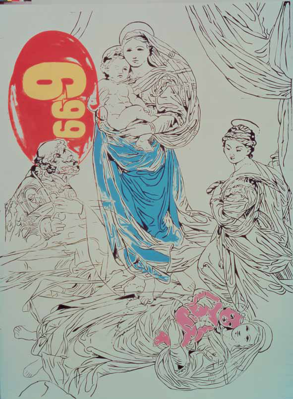
Religion does make an appearance in Warhol’s artwork, both overtly and covertly. Especially in his later years, Warhol appropriates the great religious masterpieces of the Renaissance like Raphael’s Sistine Madonna (ca. 1513-14) and Leonardo da Vinci’s The Last Supper (1495-98).

Andy Warhol, Raphael Madonna-$6.99, 1985.
 

Andy Warhol, The Last Supper, 1986.

The works that Warhol appropriates – Raphael’s and Leonardo’s- are celebrities of the art world in the same way that Marilyn Monroe and Campbell’s soup were celebrities of their various spheres (Hollywood and the American supermarket shelf, respectively). Warhol utilized images that were immediately recognizable and had been so massively reproduced that their original devotional meanings had been all but lost. Works such as these (and there are a whole slew of The Last Supper-inspired works by Warhol, including some involving a black light) involving famous religious scenes, make the viewer question whether Warhol is tipping his hat to his religious beliefs, mocking now-meaningless icons with further commoditization, or (and this is my belief), a complex, very Warholian combination of the two.

Overtly religious subject matter isn’t the only way in which Warhol’s religion intertwines itself with his artwork. Consider his famous Marilyn Diptych from 1962

And compare its form to

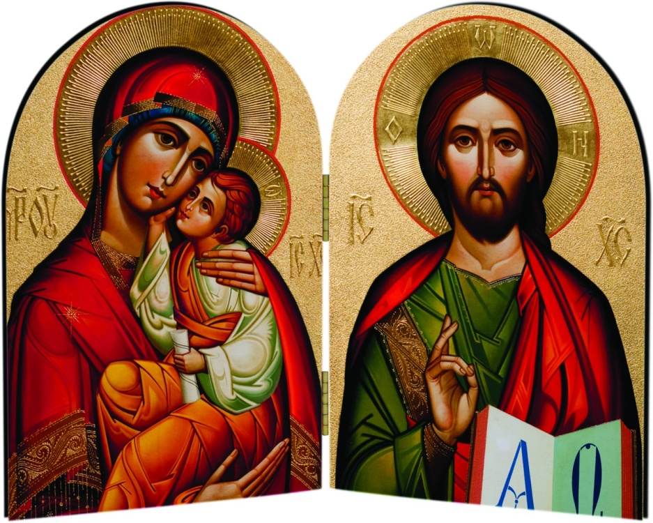
Byzantine Madonna and Christ Diptych

The diptych is an ancient form of two flat sides connected in the center, best known for its religious uses.  In Byzantine Catholicism (the Ruthenian church attended by Warhol falls under the umbrella of the Eastern Catholic Church), religious icons like the Madonna and Christ are often depicted in diptych forms, which folded for travel and allowed people to carry devotional objects with ease. Many Warhol pieces involve different panels; the Marilyn Diptych is perhaps the most famous and best example of Warhol’s appropriation of a well-known religious form.

The world-famous artist, painter of celebrities, and society oddball still clung to the comforts instilled in him in working class Pittsburgh. Warhol’s religious beliefs, although kept fiercely private by the artist himself, were a major part of his life and his art.

The Arrogance of Beauty: Whistler’s Peacock Room

December 30, 2011

- See all 9 of my articles

No Comments

As 2012 approaches and we begin to make promises to be the better, kinder, thinner people that we didn’t become after last New Years, I thought it would be a good idea to consider an artwork steeped in snarky wit and revenge.

I am obviously not a fan of New Years’ resolutions.

James Abbott McNeill Whistler was born in Lowell, Massachusetts, in 1834. The third son of West Point graduate and civil engineer Major George Washington Whistler and his second wife, Anna Matilda McNeill, the young Whistler spent much of his childhood in Russia after his father was charged with the construction of a railroad from St. Petersburg to Moscow. In the family tradition, he enrolled at West Point in 1851, but was dismissed for poor chemistry grades. Determined to be an artist, Whistler packed up his brushes and moved to Europe in 1855, never returning to his native country.

London and a patron

After a few years in Paris where he hobnobbed with avant-garde artists like Courbet and Manet, Whistler moved to London in 1859.  Whistler’s decision to settle in London had lasting impact on his artistic output. Had he worked in America, he likely would have been affected by Puritanical tendency to imbue art with moral purpose. Had he remained in Paris, he would have been caught up in the burgeoning modernism that inspired artists like Monet, Degas, and Renoir. As it happened, London allowed Whistler to develop his own theory of art, based on the idea that art needs no literary or moral narrative, and should exist solely for its own sake. His was the philosophy of aestheticism, which believed recognized beauty as the only requirement of art.

Whistler’s reputation for unusual art and a sassy personality were already well-established when he arrived in London. He was especially well-known for cutting barbs aimed at critics who disliked his work and arrogant remarks about his own talent. “I can’t tell  you if genius is hereditary, because heaven has granted me no offspring,” and “I maintain that two and two would continue to make four, in spite of the whine of the amateur for three, or the cry of the critic for five,” are merely two examples of his infamous acerbic wit.

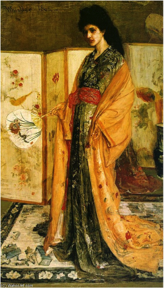
Wealthy British shipping magnate Frederick Richards Leyland was one of Whistler’s most important patrons. The Leylands – Frederick and his wife, Frances – were enthusiastic collectors of blue and white Chinese porcelain, and the dining room of their home functioned as a display case for their magnificent collection. Whistler had even painted a portrait of famed beauty Christina Spartali in fashionable Oriental costume as a centerpiece for the room’s theme.

Whistler, Rose and Silver: The Princess from the Land of Porcelain, 1864, oil on canvas.

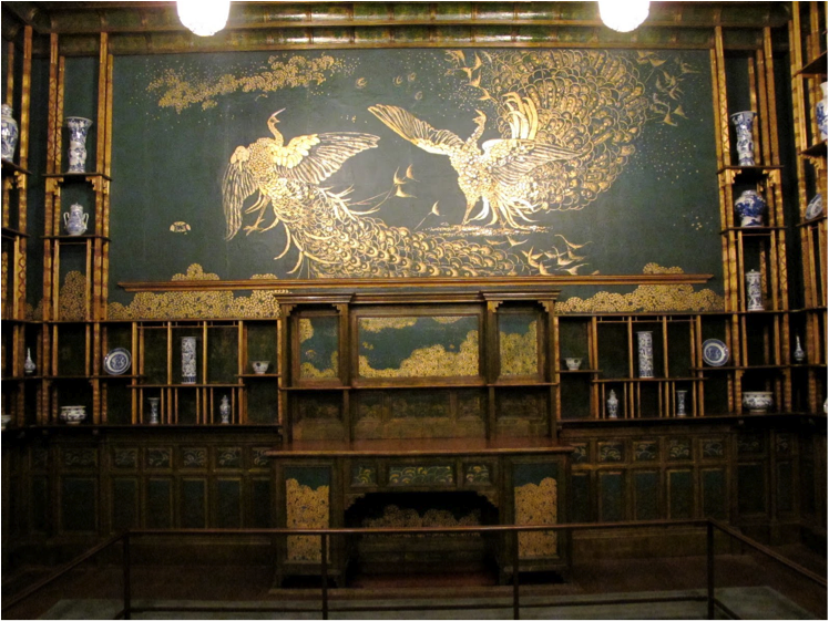
Even with the addition of his painting, Whistler was displeased with the room itself. He felt that the designer’s (famed architect Thomas Jeckyll) emphasis on neutrality and natural light as a foil for the porcelain didn’t celebrate the essence of the exotic objects.  In 1876, when Jeckyll fell ill and Leyland was away on business, Whistler proposed modest changes to the décor to his patron, which Leyland approved.  Where Jeckyll envisioned a sunny Chinese pavilion, Whistler wanted to create a stunning, intimate jewel box of a room. The room became a 3D painting, a work of art that you could walk around inside.


Not exactly “modest”

By the time Whistler had finished, scarcely a trace was left of Jeckyll’s design. The room was ablaze with gold and copper leaf, which covered nearly every surface. Whistler set these glowing metallics off with a rich blue-green. Even spaces hidden by shelving were decorated with tapestry-like patinas to set off the texture of the porcelain.  Whistler wrote Leyland a letter about the room, describing it as, “a gorgeous surprise.” What surprised Leyland most were not the actual “modest” changes that Whistler had made to the room, but the bill, which was almost 2,000 guineas more than he had expected (about $200,000 in today’s money – NOT a small amount.)

Revenge

When Leyland angrily said that he would pay only half of the projected amount, Whistler began another addition to the room’s décor – a mural of two peacocks on the wall facing his Princess. Titled Art and Money or The Story of the Room, two gilded peacocks prepare to fight on a field of Prussian-blue leather (the very fact that Whistler painted the very expensive leather was another slight to Leyland). The peacock on the right has excessively ruffled feathers, Whistler’s homage to the ruffled shirts that Leyland favored. At the feat of this peacock are silver coins – the money that Whistler believed Leyland was selfishly keeping from him. The peacock on the left is crowned by a silver feather; similar to the shock of white hair that Whistler was famous for. Legend tells us that after Whistler completed the work in 1877, Leyland declared that he would have Whistler horsewhipped if he came to the house again. He did, however, keep the room just as Whistler designed it.

For an artist who once proclaimed, “People will forgive anything but beauty and talent, so I am doubly unpardonable,” Whistler was ultimately pardoned and even vindicated for his design of what came to be known as The Peacock Room. After Leyland died, the room was purchased whole by Charles Lang Freer, an American railroad tycoon, who installed it in the dining room of his Detroit mansion. Thirteen years before his death, Freer bequeathed his entire Whistler collection to the Smithsonian, where the room has remained ever since, one of the most important examples of the aesthetic movement and interior design in the world.

That Pinot Clashes With The Drapes: On Art And Wine

November 30, 2011

- See all 9 of my articles

No Comments

Art and wine have a lot in common. And not just because the art scene is notoriously wine-soaked. As someone who has worked at a lot of museums and more than one wine shop, I can attest to the fact that, although most art and wine lovers are fantastic people, there is a small but vocal subsection of patrons that, when they begin to espouse their opinion (and they will), make you want to smash a bottle of whatever is at hand and go at them Patrick-Swayze-in-Roadhouse style. These are the people who make you feel like a fool for confusing the air conditioning vent for a piece of Minimalist sculpture or not being able to list the number of grapes legally allowed in Chateauneuf-du-Pape (thirteen, for those keeping score at home). These people are what I like to call ruiners. It’s not enough to loudly proclaim their knowledge (such as it is) for all to hear – they have to make you feel bad for your lack of expertise or question what information you thought you had on a topic. When I rule the world, ruiners will be dealt with severely.

Art and wine are very similar, and not just because of their attraction to ruiners. Both are, in my opinion, largely subjective subjects. While I was a wine shop girl, I developed three categories for the wine in the store: wine that you love and tell people that you love, wine you love that you’re ashamed of, and wine that you “should” love that you hate. Art can be divided into these same basic categories.

I absolutely adore the works of Marc Chagall, Johannes Vermeer, and Rembrandt van Rijn. If it was financially feasible, I would cover the walls of my studio apartment in their art (of course, since it’s my fantasy I could probably have a larger apartment). I am slavishly impressed by their masterful technical abilities while simultaneously committing the ultimate art historical sin of referring to their works as “gorgeous.” Art historians are supposed to have better words to describe paintings. But to me, these works are gorgeous. I appreciate them for the technical prowess, for the accumulated weight of art history that lead the artist to this exact point, and because they are damned pretty. Works like these constitute the first category – no ruiner would dispute that all of these artists are masters of their craft. It is completely acceptable to vocally enjoy all of these artists.

I confess, people who work in wine stores totally talk about your purchases after you leave. If you come to the register with a cart full of White Zinfandel and sweet Riesling you are a) probably a white woman and b) judged behind your back. These wines are uncomplicated, easy to drink, and generally fairly sweet. They find their artistic equivalents in the work of Currier & Ives, Thomas Kincaid, Bob Ross, and many of the Impressionists. These works are generally aesthetically pleasing; using complementary, bright colors, balanced compositions, and either obvious narratives or no discernable narrative at all – only a beautiful contemplative scene. They are widely reproduced (how many Monets have you seen in dentist office waiting rooms?) and don’t require any artistic knowledge to appreciate. And, like sweet Riesling, if you list any of the aforementioned as your favorite artist in the presence of an “art expert” (self-appointed or otherwise), you will be judged.

There is nothing intrinsically wrong with any of their art. Although the first two examples given employed large workshops to produce their works, there is still technical virtuosity present. Their work is pretty and popular. These artists, like the alcoholic parallels, have mass appeal and are harshly judged because of it.

The only thing to do with art or wine in this second category is to own your taste. If you love Sutter Home White Zin and Monet’s Haystacks, then shout it from the rooftops. Your tastes may change as you learn more about wine and art, but maybe they won’t. And when you proudly state that you love such “embarrassing” things, you generally find a lot of people sheepishly agreeing with you. I have a MA in art history and there were several Monet prints strewn about my apartment because his work matched my couch and throw pillows. It looked pretty, dammit.

The final category is often the most guilt-inducing. You may impress your friends by serving an Italian Barbera d’Alba that was cellared for ten years with your Thanksgiving dinner, but it probably won’t complement the food as well as an easy-drinking Zinfandel and crisp Sauvignon Blanc. I absolutely understand that Salvador Dalí, Andy Warhol, and Francis Bacon are modern masters whose work is essential to the understanding of modern art history, but I still hate them. Hate them. I have been forced to spend large amounts of time on all three of them at different times, and it has only enforced my negative opinion of them. I know dozens of people whose opinion I highly respect that not only enjoy but adore those artists. And that’s okay. Because art, like wine, is incredibly subjective.

And this is the main point I’m trying to make. Whatever your tastes in art and wine, own them. There’s no right or wrong, only what speaks to you (and pairs well with chocolate).


Don’t Tread On Me: Benjamin Franklin And The Power Of Images

September 30, 2011

- See all 9 of my articles

No Comments

Although images were scarce in the early days of American colonialism, they became more and more important as the colonies became increasingly sophisticated, both socially and economically. Printed material was necessary for the spread of money and ideas throughout the colonies, and eventually became an essential component of the idea of breaking from Britain and establishing an American nation.

Benjamin Franklin, one of the best-known “Founding Fathers” was, among his other accomplishments, a prolific printer. He was inordinately proud of this position, so much so that he wanted his epitaph to read merely, “Benjamin Franklin, printer.” Franklin learned the art of printing from his brother James, and during his lifetime published the infamous Poor Richard’s Almanac, as well as a newspaper: The Pennsylvania Gazette. It was in the latter that one of the most iconic images of the American Revolution was first published.


Benjamin Franklin, Join or Die, The Pennsylvania Gazette, 1754

This image of the snake, first published in 1754, was directed at the Albany Congress of the colonies. Seven of the thirteen original colonies met in Albany during the summer of 1754 to discuss, among other issues, Franklin’s “Albany Plan” of a union between the colonies. This plan is made quite clear through Franklin’s simple, evocative image. Franklin was one of the first people to use the image of a snake to represent the colonies, and such was the power of the image that the practice soon became widespread. In the eighteenth century, the northeastern United States was home to both the timber and eastern diamondback rattlesnakes, and Franklin first associated America with them when he suggested that if England continued sending convicts to the colonies, the colonies should send rattlesnakes to England. In addition to imparting a local flavor, the snake was a well-known sign of the motto, “Don’t Tread on Me,” a not so subtle hint to colonial enemies (which at that time, depending on diplomatic moods, could include France, England, and various Native American tribes) that not-quite-yet Americans were not to be trifled with.

In “Join or Die,” Franklin’s assertion that the colonies must band together or be destroyed is conveyed with a segmented snake – each segment marked with the initials of one of the colonies that attended the Albany Congress. The image is dramatic yet uncomplicated – easily replicated. Ease of replication would become important as more and more people began to call for the unification of the colonies. Images like Franklin’s helped the dissemination of such ideas, indeed, Paul Revere himself (also a printer!) used the image in his protest of the Stamp Act just a few years later in 1765.

Although Franklin’s Albany Plan was not passed by the Albany Congress, it went on to provide vital groundwork for the 1777 Articles of Confederation and 1787 United States Constitution. “Join or Die,” however, was arguably much more powerful than any political agenda. The simple image of the partitioned snake explained the cause of the colonies more clearly and effectively than words ever could.

E Pluribus Unum: History of American Imagery*

August 26, 2011

- See all 9 of my articles

2 Comments

*When I say “American” imagery, I’m referring to images beginning with the appearance of white Europeans on the continent. Native Americans have an incredibly rich and diverse history of image making, which I have not studied nearly enough to do justice to it.

Images were rare in early colonial America. Many of the settlers were religious refugees from Europe, where the more ostentatious religions of Catholicism and Anglicanism were intolerant of their austere beliefs. The Calvinists and Puritans that made up early white America took the biblical saying “cursed is the man who carves an image or casts an idol” [Deuteronomy 27:15] very seriously. Puritans often complained about the Catholic devotion to paintings and sculptures in their churches, which they considered to be idolatry. Protestants focused on the word of God, and their plain, clean-lined churches reflect this.

It is perhaps a little surprising, then, that some of the first images produced by colonial Americans are portraits of ministers. John Foster’s woodcut of Reverend Richard Mather from 1670 (the first portrait print in the colonies),

is typical of pre-eighteenth century images of preachers that would have appeared in books of sermons. Calvinists justified such images by regarding them as moral examples of faithfulness, meant to inspire such feelings in the readers. The importance of the word of God is emphasized by the presence of the Bible, which the Reverend Mather is engaged in reading (note the dainty glasses he holds in his right hand). One of the most important Protestant tenets was reading the Bible yourself to gain a personal understanding of God. John Foster was a member of Mather’s congregation, and would have been familiar with all these principles.

It is evident from looking at the Reverend Mather that Foster was not a trained artist. The woodcut is simple and somewhat blocky, lacking the finesse typical in woodcuts done in Europe by trained artists at the same time. This was typical well into the colonial period. Trained artists were not in high demand in the new settlements, and those who did produce images were typically copying the work of European artists. However, although the print is lacking in depth and realism, Foster paid a lot of attention to the details in the face, especially the kind expression in the eyes.

If Reverend Richard Mather’s portrait represents the birth of American images, his grandson Cotton Mather’s portrait by Peter Pelham in 1728,

represents how far American imagery had come in just over half a century. Cotton Mather was the son of Increase Mather, another preacher in the mold of his father, Richard Mather, and while their Calvinist religious beliefs were the same, their portraits are wildly dissimilar.

Peter Pelham was a well-known mezzotint engraver based in Boston. Trained in England, he brought European expertise to America, and was, in fact, the stepfather of America’s first native painter, John Singleton Copley. Mezzotint, which involved roughening the print plate with thousands of little dots made by a toothed metal tool, allows for a much greater variation of tone than woodcut, and Pelham’s expertise and training is clear in the great realism of the facial details and shading, and the delicate curls of Cotton Mather’s intriguing hair. Even the slight tonal changes in the background and Mather’s delicate beribboned bib speak to the advances made in American art in less than a century. Where Foster’s work was simplistic, austere, and geometric, Pelham’s piece is detailed, sophisticated, and evokes the best European work of the period.

In spirit, both works represent the Puritanical religious spirit that still envelopes the American colonies. Colonists prided themselves on their religious purity and austere lives, even as they began to thrive and become wealthy. This new wealth is evident in Cotton Mather’s elaborate outfit and hair, set against the much more modest attire of his grandfather. In the fifty years between the two portraits, American colonists began to value images more highly, recognizing them as an ideal medium for spreading values and ideas to a wide group of people, regardless of their literacy level. This democratic property of images allowed art to become more and more important to colonists as they began their struggle for independence.

You Know You Love Us: Art as Propaganda

July 29, 2011

- See all 9 of my articles

1 Comment

In 2007, the German Historical Museum in Berlin opened an exhibit titled, “Art and Propaganda: The Clash of Nations 1930-1945” (curated by Dr. Hans-Jörg Czech and Dr. Nikola Doll). As you can no doubt tell from the time period under observation, the show displayed artwork from Italy’s Fascist regime, German National Socialism (Nazism), and Soviet Communism. There was also an extremely controversial fourth nation represented: the United States. American New Deal-era artworks were displayed alongside those glorifying Mussolini, Stalin, and Hitler. Unsurprisingly, American viewers protested their inclusion alongside such unsavory company – virulently anti-Semitic posters showing Jewish people as bloated rats, Futuristic sculptures of Mussolini’s (il Duce’s) continuous profile, and ridiculously toady-ing portraits of an insanely idealized Joseph Stalin.

This intensely negative reaction is unsurprising, given the continuous American fascination with WWII, and our heroic place in it. Early twentieth-century Germany and Italy are colored black in our heads, although Russia was nominally on the Allied side, the degeneration into Cold War politics that followed the war knocks them into the same monstrous camp of forced deportations and genocide. To place American artworks – posters, paintings, sculptures, and other materials, alongside those of the three fiends of the twentieth century – the horror!

Generally speaking, the modern world takes a dim view of propaganda. Propaganda, to most of us, is the province of Saddam Hussein, Muammar Gadaffi (how have we as a people not decided how to spell this man’s name yet?), and the most James Bond villain-esque of contemporary dictators, Kim Jong Il. Propaganda is giant gold fists crushing Americans planes and having your face subtly displayed on two-story building-size posters. This view, however, is incorrect. Technically speaking, propaganda is the spread of ideas or information to further the cause of an institution or person. That ASPCA brochure you got in the mail this morning? Propaganda. The “Easy Ways to Redecorate Your Bathroom” article in the new Martha Stewart “Living”? Propaganda (but you knew that one). The integration of art and propaganda is not a new combination – Hitler and his ilk were drawing from thousands of years of using images to influence public opinion.

Although kings, queens, pharaohs, and emperors are some of the most obvious users (and abusers) of art as visual propaganda, I chose to dedicate much of my artistic education to considering the artistic propaganda of perhaps the largest and most powerful institution of the last two millennia of Western civilization: the Catholic Church. For Christianity’s first 1500 years or so, what became the “Catholic Church” was simply the Church, the only game in town.

Christianity began as a religion of the poor and dispossessed in backwater Roman provinces; they used artistic representation sparingly. Digging back to your Sunday School days (or, lacking those, “Intro to Religion” college courses), you might remember the Old Testament story (Exodus) in which Aaron created a statue of a golden calf to calm the Israelites while Moses was up on Mount Sinai. The calf was meant to be a stand-in for the Hebrew God, but greatly invoked the bull worship that was common in many cultures at the time. As if invoking paganism wasn’t bad enough, the creation and worship of such a statue was idolatry – the worship of an image – specifically forbidden by Jewish law. Of the three Abrahamic religions: Judaism, Christianity, and Islam, Christianity is the only one that dispensed pretty thoroughly with the anti-graven images rule. This is less of a commentary on specifically Christian theology and more a result of Christianity emerging at the height of the Roman Empire, a time when Roman art was at its classical zenith.

As Christianity evolved from being the religion of slaves and poor minorities to the official religion of the empire, its artistic tradition developed from its early austere, primitive style (a loaded term in the art world, but evocative) to the highly naturalistic, incredibly detailed style one associated both with the Roman classical world.

This inherited artistic tradition was perhaps Christianity’s greatest weapon in the pursuit of believers (actual weapons were sometimes involved, as well). In ages where the vast, VAST majority of Europe’s population was illiterate (Dark Ages even into the Renaissance and beyond), the Church’s use of images helped explain and spread their beliefs to millions of people who otherwise would never have understood. The official language of Christianity was Latin, a language the Church’s own priests often had scanty knowledge of, and certainly no common parishioner understood a single word said in Mass. What they could understand, however, were pictures – scenes of the Nativity, Raising of Lazarus, and the Last Judgment in stained glass, prayer books, and wall frescoes. These works of art explained Christianity better than any priest ever could, and as Christianity evolved and eventually split, what became the Catholic Church clung to images as a continued means of impressing and convincing their parishioners that their way was the correct way.

Some of the best-known artworks in the Western world are blatant Christian propaganda. The Sistine Chapel, Raphael’s frescoes in the Vatican Stanze, Michelangelo’s David – all out to convince their viewers that Catholicism is the way. The fact that these works are propaganda in no way decreases their value as art; in fact, it emphasizes the very power of images and establishes that art is an extremely powerful force that can be utilized for good and evil.

Therefore, America’s inclusion in the Berlin exhibit wasn’t an inherently negative comment on Rooseveltian politics – just a nod to our obvious knowledge of the propagandistic power of images.

Tolstoy and “Happy Trees”

June 24, 2011

- See all 9 of my articles

1 Comment

This week, we welcome Princess Kate to the staff as the resident art expert.  I am subject of her realm – on more than one occasion, I have dropped to my knees awaiting her command.  (OK, maybe I was actually just running cables to her computer).  Without futher ado, Princess Kate …

As a child of the eighties who spent a sizable amount of my formative years watching television with my grandmother, I have vivid memories of Bob Ross’s PBS program The Joy of Painting. It must be said that my grandmother only got three channels on her 1970s-era set, so it was either Bob Ross or local news. However, I was always quickly entranced by the dulcet tones of the “happy trees” artist (his rockin’ white-man ‘fro was mesmerizing in its own way). Not an artist myself, his natural way with brush and paint was impressive, and the resulting paintings, to my five-year old eyes, were masterworks.

Twenty-odd years later, I gained both a BA and MA in art history, traveled to Italy, France, Germany, and Turkey during the course of my research, and saw many of what are considered to be the greatest artworks in the world. In the course of all the newly-acquired “high art” knowledge, I forgot all about dear Bob Ross and his “happy trees” until a friend jokingly asked about the topic of my MA thesis. “Bob Ross, right? The ‘happy clouds’ guy?” Although my first response was derisive laughter, his sass-pot suggestion did get me thinking about where artists like Bob Ross fell in the accepted artistic canon.

Anyone with even a passing interest in the art world knows that Bob Ross paintings aren’t considered “high art,” or even “art.” They don’t hang next to Renoir’s in world-renown museums and don’t come up for auction at Christie’s for record-setting amounts. Bob Ross himself once said:

I’ve never claimed that this is investment art. When we first started out, all the art colleges and universities across the country would sort of badmouth what we were doing.

I was initially attracted to art history because of my fascination with man’s drive to create. As soon as our ancestors became recognizably human, they began to make pictures – scratched on the walls of caves, carved into rocks, traced in the mud. Even today, the meaning of these images can only be guessed at – magical images meant to ensure a successful hunt, symbols pertaining to fertility or a prodigious harvest – any number of options. What is known is that humans are alone in their urge to create art – to paint, to draw, to sculpt. The drive to create aesthetic objects that operate as conduits for emotion is one of the surprisingly few characteristics that are specific to man. Leo Tolstoy (author of such light reads as Anna Karenina and War and Peace) once wrote that, “If the spectators or audience are infected by the feelings that the author felt, it is art.” Although this view if not what is taught in most classical art history programs, it has always stuck with me as my personal belief about what art really is.

To me, then, there is no line drawn between high and low art, because, if the work translates the artist’s feelings and intention, then it is ART. So Bob Ross paintings and those done by his followers, while not generally seen as being on par with Raphael’s Vatican Stanze or Monet’s views of Rouen Cathedral, still communicate emotion to their viewer. Bob Ross’s programs were so full of happiness that they were one rainbow cupcake away from being a Care Bears special, and I dare you to look at one of his paintings (or a homemade copy thereof), and not feel the pure joy of existence that they communicate. Even if a homemade copy is blurred and features an abnormally large, oddly phallic-looking tree (anyone familiar with Bob Ross will remember that he was a committed advocate of “the big tree”), there is emotion there – whether the infectious happiness of Bob Ross or something more subtle, like hope or wistfulness.

My main point, which, blessedly, allowed me to reference two of my favorite things (white man afros and Tolstoy) is that I want this column to consider all human creations equally, regardless of where they fall in the accepted artistic canon.

And so it begins.